The Studio Visit That Changed the Room
 anchoring the right wall; block printing ink and acrylic on canvas.")
Closing out the year with a project that was pure joy to shape. Thought I’d give you a peek into a home that came together because the clients were curious, generous, and open to what art could do for the way they live. They’d just finished a major renovation; the house is sun-filled and warm, and they wanted to layer color, texture, and stories that reflect roots in Singapore, South Africa, Canada, and India.
Where we started

We began before the moodboard—with conversations about what moves them. Were they drawn to abstraction or figuration (and why)? What felt meaningful versus merely symbolic? The through lines that started to emerge were materials with hand and history (nothing glossy), and a decisive anchor that could hold layers of meaning and connection. Early on, a Paulo Nimer Pjota (bottom row, second) we saw at Frieze clarified the brief—bold color, layered storytelling, emotion before labels.
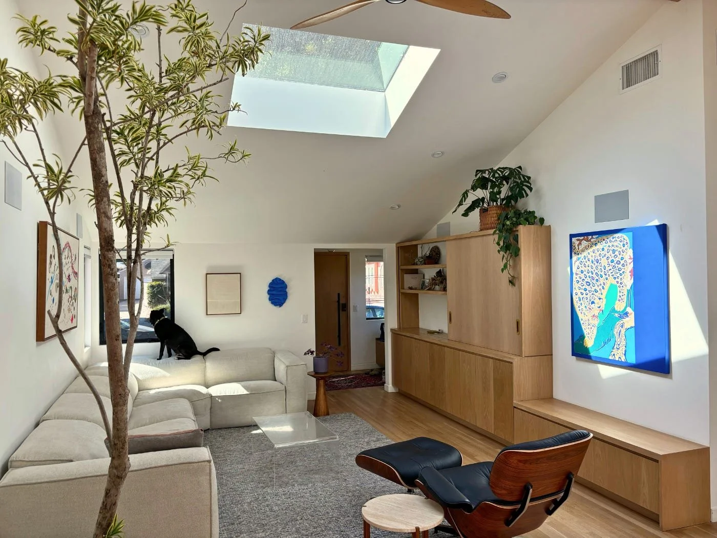
The family room brief
This is the heart of the home—the first space that greets guests and the place everyone lands at day’s end. The skylight throws strong light across one wall, a long oak built-in runs the length of the room, and the space needs to read from multiple angles.
From the start, we knew we’d pair one decisive anchor with two material-forward works—and we wanted a sculptural note above the sofa (more on that below).
The counterpoints we found first
While we studied options for the anchor, two pieces clicked immediately—true “you just know” moments:

Alyssa Breid’s woven canvas, a minimalist geometry in thread that gives the room its slow heartbeat.

Jessica Sellinger’s cobalt wall sculpture, small in scale with big presence, a joyful fold of color between neutrals.
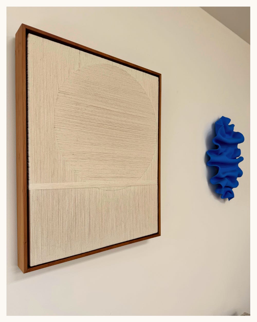
Together they gave us structure and softness—saturated blue meeting raw thread. They became the foundation for the room’s yin and yang.
The anchor that chose us back
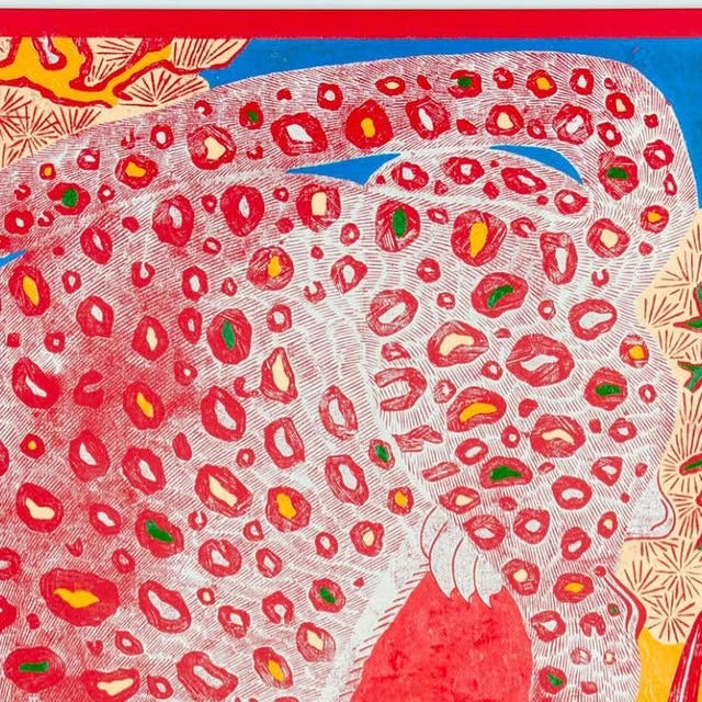
We kept returning to a body of work that felt right for this family—contemporary, layered, and in conversation with global visual histories. I’ve followed Kour Pour for years; his practice challenges the myth that abstraction was “invented” in early-20th-century Europe, tracing lineages to Islamic geometry, Persian manuscripts, Inca textiles, Tantric paintings, and more (highly recommend this for further reading). His shaped canvases make those connections visible—reframing canon, honoring source traditions.
When I reached out, the piece they loved had sold. Kour invited us to his Inglewood studio anyway. My clients brought their family and as they experience the studio - finished works, in process pieces, the colors, the inspiration - something unlocked.
 showing stylized tiger patterning and layered marks in cobalt, gold, cream; block printing ink and acrylic on canvas.")
We landed on a commission, Tiger in Blue, drawing on a Korean folk pairing: the tiger as protection, the magpie as good news and beginnings. It’s a symbol set that met this moment in their lives.
 mounted above an oak cabinet beneath a skylight, natural light washing the wall.")
If you’re tired of scrolling Pinterest for hours and still not knowing what art actually fits your space (or your soul), I can help. I’ve spent years discovering emerging artists and learning how to match people to work that genuinely resonates. Whether you need a framework to discover your style or hands-on guidance curating specific pieces, there’s a way we can work together. Learn More
Living with art
 in a slim wood frame above the bed.")
We first tried this piece by Vanessa Valero (above) in the living room, but it wasn’t quite right for the wall size—or for how the room gets used (lots of gymnastics off the couch!). We moved it to the bedroom and it immediately exhaled.
Valero’s piece, part watercolor, part embroidery, is a meditation at eye level - the right tempo for waking up and the last look before sleep. What I love most here is the conversation between hand and wash—the thread carries the memory of touch; the watercolor carries breath. It echoes home’s themes of the home overall. It is not overt, but if you notice the colors, materials, and stories from room to room, you can feel the hum of a space in harmony.

Why this home, this way
This project is about choosing with conviction and letting light and life tell you where each piece belongs. Artworks become companions—through the highs, the lows, and the everyday in between.
This project is about balancing material, color, style, and story until a space feels like you. A home with stories and space for warmth, joy, and memories - old and new. And the artworks become companions through the highest of highs, lowest of lows and of course the everyday in between moments. The rest comes in time - the best collections are lived in, not rushed.
To keep discovering new voices in emerging art, get the context behind the stories that shape them, and belong to a community redefining the art world subscribe below
Photos courtesy client and my own
This post contains some affiliate links, so if you chose to purchase something via a link with an affiliate fee I make a small commission at no cost to you.